Card Efficiency Analytics Explained for Delivery Teams
A delivery-lead guide to card efficiency analytics in BreezeLeave: how role-mix flags (QA over Dev, missing QA, design-heavy, unclassified time) and the 0-100 delivery health score read team hours.
A delivery lead opens the sprint retro on a Tuesday afternoon. The standup notes look clean: tickets moved, cards closed, nothing on fire. Then the ClickUp time entries get pulled in and the picture changes. One large card closed with zero QA hours. A client-facing build absorbed twice the QA time of the development time. A third of the logged hours sit under unclassified work because the people doing it never picked a role. The retro stops being a victory lap and starts being a conversation about whether the team's effort mix matches the work.
This article is for the delivery lead trying to read card efficiency analytics in BreezeLeave as a planning signal, not as a performance review. It walks through what the report actually reads, the four role-mix flags it emits, the 0-100 client delivery health score that rolls up from those flags, and where it misleads.
Honest framing first. BreezeLeave reads logged hours by role and surfaces patterns. It does not compare estimates against logged time because ClickUp estimate fields are inconsistently used across teams and the comparison would lie more than it would help.
What card efficiency actually reads
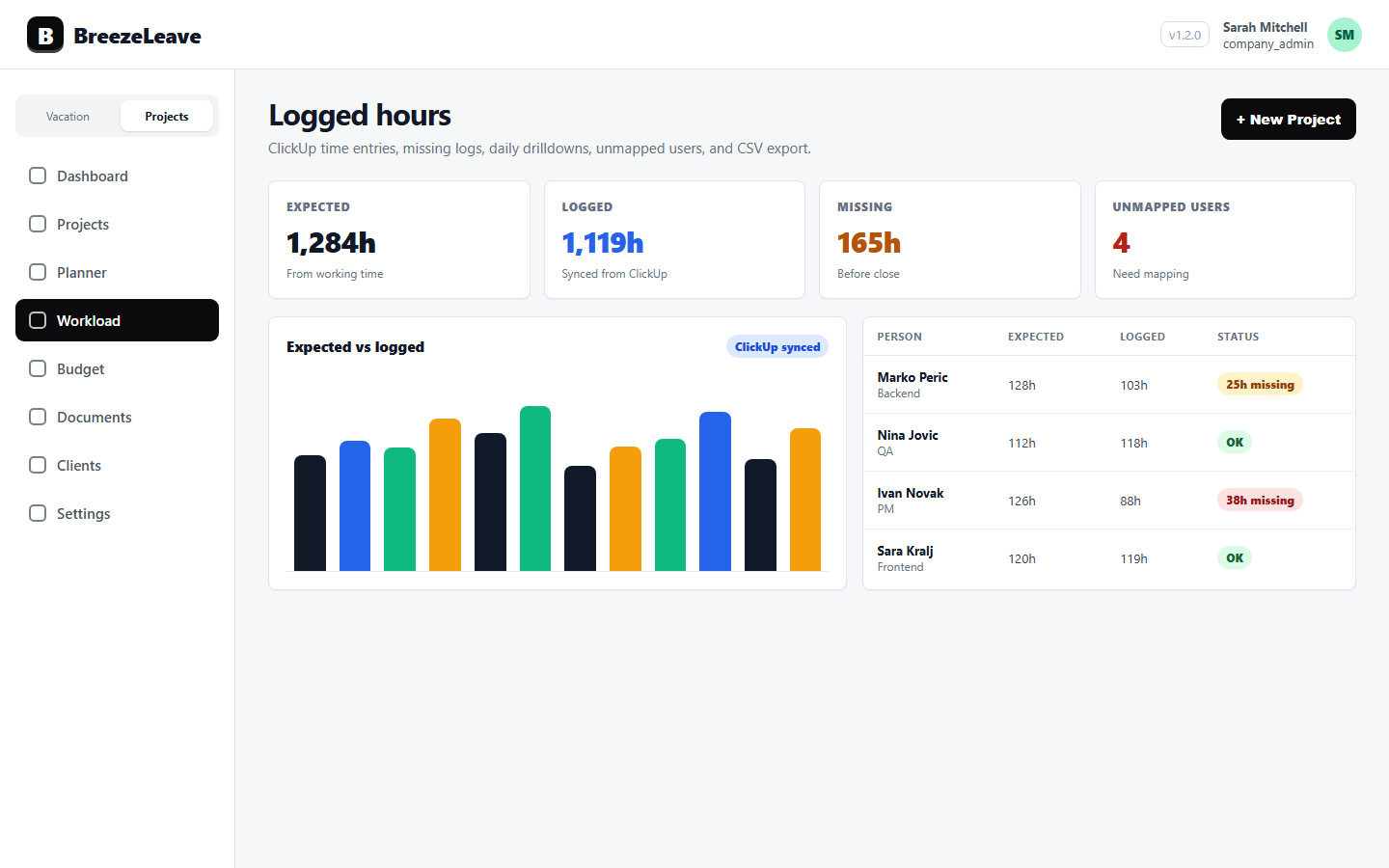
The card efficiency report pulls ClickUp time entries for the period you select, joins them to the resource assignment table (which maps each person to a team role), and groups the hours by ClickUp task. The output for each card is the distribution of hours across four role buckets: Developer, QA, Designer, and Unclassified.
The buckets are filled by the person who logged the time, not by the card. A front-end developer logging time on a card pushes hours into the Developer bucket. A QA engineer logging time on the same card pushes hours into the QA bucket. A person whose team role is not yet set falls into Unclassified.
That distinction matters. The report is about effort mix per card, not about whether a card hit its planning target. BreezeLeave does not pull ClickUp estimate fields. There is no per-assignee efficiency score either. The signal is the shape of the hours: which roles carried the work, and whether that shape looks right for the type of card.
The four flags the report emits
Each card gets evaluated against four flag rules. The flags surface in the panel sorted by severity (red first, yellow next) so a delivery lead can scan the cards that deserve a conversation.
- QA over Dev (red). QA hours exceed Developer hours by more than 20 percent, and both buckets have hours. The pattern usually points at heavy rework, unclear acceptance criteria, or a card that bundled too many states.
- Large card with no QA (red). Total logged hours pass 40 and the QA bucket is zero, and the card is not design-led. The pattern points at a skipped step, a card that bundled too much under one assignee, or QA time logged against a different card.
- Design over Dev (yellow). Designer hours exceed Developer hours while Developer hours are above zero. The pattern points at discovery spillover, unclear brief, or a card that should have been split into discovery and implementation.
- Unclassified majority (yellow). Unclassified hours exceed 50 percent of the total on the card. The pattern almost always points at a team-role mapping gap, not at delivery drift. Fix the role mapping first, then re-read the card.
Red flags interrupt the report. Yellow flags ask for a quick look. A card with no flags is not in the panel at all, which keeps the scan short.
The 0-100 client delivery health score
Beneath the card list, BreezeLeave rolls the flags up to a per-client delivery health score. The score takes the share of flagged cards over the total cards in the period, weights red flags more heavily than yellow, and returns a 0-100 number that points at which clients deserve a delivery conversation this week.
A score of 95 means almost every card in the period passed the flag checks. A score of 60 means a meaningful slice of the work is flagged. The score is a triage tool, not a verdict. A client with a score of 70 might be on a tricky discovery sprint that legitimately runs design-heavy. A client with a score of 90 might still have one red flag worth a 10-minute review.
The score lives on the client detail page in BreezeLeave and on the company-wide analytics page. It is not surfaced to the client. The audience is the delivery lead.
| Score band | Reading | Action |
|---|---|---|
| 90 to 100 | Effort mix matches the work type | Note any single red flag; otherwise no action |
| 75 to 89 | A handful of cards out of pattern | Scan the flagged cards; decide if a process tweak helps |
| 60 to 74 | Several cards flagged, including reds | Add the client to the weekly delivery review |
| Below 60 | Pattern, not outlier | Treat as a delivery-health discussion, not a card review |
Where the panel appears in the product
The card efficiency panel sits on four pages so the same data is read in different contexts:
- Project detail. The panel scoped to one project, useful inside a sprint retro or a single-project review.
- Projects (org-wide). All flagged cards across every project for the period, useful for a weekly delivery scan.
- Client detail. The delivery health score for that client plus the flagged cards under their projects.
- Person stats. Filtered to cards a specific person worked on, useful when a one-to-one conversation needs context rather than a scorecard.
The same flag rules run on every page. The difference is the filter: project, client, person, or org-wide.
Reading the flags as planning questions
A flag is a prompt, not a verdict. The instinct after seeing a QA-over-Dev flag is to ask the developer or the QA engineer why the card needed so much testing. That is usually the wrong first question. Five things produce QA-heavy cards more often than effort:
- Acceptance criteria were vague. The QA engineer wrote them during testing, which doubled the work.
- The card bundled too many states. Empty states, permissions, mobile behavior, and error handling under one task.
- The change touched edge cases. Genuinely sensitive area that deserves the testing time.
- QA time was logged against the wrong card. Hygiene problem more than delivery problem.
- The handoff between developer and QA was thin. QA spent the first half rebuilding context.
The same logic applies to the other flags. Large card with no QA might mean a deliberate skip, or it might mean QA logged against an umbrella card. Design over Dev might mean discovery spillover, or it might mean the developer logged time to a sibling card. The flag tells the lead which conversation to start; the card detail tells the lead what to say.
Fix unclassified before reading anything else
Unclassified majority is the flag most worth fixing at the root. The bucket fills when a person who logged time on a card has no team role set on their BreezeLeave profile. Their hours land in Unclassified, which makes the card look like a role-mapping problem instead of a delivery problem.
Two minutes per person on the team setup page fixes this. Once the roles are set, the next sync moves those hours into the right bucket and the unclassified flag usually disappears. Card efficiency on a half-mapped team is worse than no card efficiency at all.
How the score feeds capacity planning
A persistent low delivery health score on one client points at staffing pressure. Many QA-heavy cards usually mean the QA capacity on that client is being stretched across too much development work. Large-card-no-QA flags often mean the developer is closing cards without handing them off. Both patterns are capacity conversations, not performance conversations.
For the broader capacity-planning context, see project capacity planning for agencies.
When card efficiency is not the right signal
A few scenarios where the report misleads more than it helps:
- Research and exploration work. A discovery sprint runs design-heavy by definition. Reading the design-over-dev flag as a problem is chasing the wrong number.
- Internal infrastructure cards. Some cards (build pipeline, tooling) never need QA. The large-card-no-QA flag is noise for that work.
- Periods with low logged hours. A sparse period produces few flags and a noisy score. Read over a sprint or a month, not a slow week.
- Teams with thin role mapping. If half the people lack a team role, the report is mostly unclassified noise. Map first, then read.
Use the report where it fits. Skip it where it does not. A delivery lead who treats every yellow flag as a bug optimizes the wrong number.
A small monthly routine
Once a month, take 30 minutes for card efficiency. Steps:
- Confirm the team-role mapping has no gaps.
- Open the org-wide card efficiency view for the past 30 days.
- Read the delivery health score per client. Note the bottom three.
- Open the flagged cards under those clients. Drill into two or three reds.
- Decide one process change for next month.
One change per month is enough. Tighter acceptance criteria on a card type, a QA handoff template for a specific phase, splitting a recurring large card, or assigning a dedicated QA contact to a client. Small repeated changes compound faster than a single large initiative.
Before any of this is useful, the underlying time entries have to be clean. The hygiene routine in the ClickUp logged-hours hygiene checklist is the precondition. Card efficiency on bad data is worse than no data at all.
Quick reference: how to read the card efficiency report
- Confirm team-role mapping is complete (unclassified should be small).
- Scan the red flags first: QA over Dev, large card with no QA.
- Read the yellow flags next: design over Dev, unclassified majority.
- Use the delivery health score to triage which clients deserve a review.
- Drill into one or two cards under a low-score client.
- Treat flags as planning prompts, not performance scores.
- Skip the report for research work, low-log weeks, and infrastructure cards.
Card efficiency analytics surface the shape of the team's hours. Used carefully, they help a delivery team plan more honestly. Used as a performance scorecard, they break the trust that makes the time entries truthful in the first place. To start reading card efficiency for your team, head to pulling ClickUp time into BreezeLeave.