Card Efficiency Analytics for Agency Delivery Teams
How agencies can use card-efficiency signals like QA-heavy work, missing QA, design-heavy effort, and unclassified time to review delivery drift.
Project totals can look calm while the work underneath is starting to drift. The budget still has room. The milestone still looks reachable. The weekly status update says the sprint is moving. Then a project manager opens the card history and finds the real story: one feature spent most of its time in QA, another large card shipped with no QA time at all, a design task quietly turned into a multi-day exploration, and several entries are sitting in "uncategorized" because nobody knew where to put them.
None of those signals automatically means something is wrong. Agency delivery is messy. Some cards deserve heavy QA. Some documentation work does not need a formal QA step. Some design cards expand because the client finally clarified the problem. Card-efficiency analytics are useful because they make those patterns visible early enough for a useful conversation.
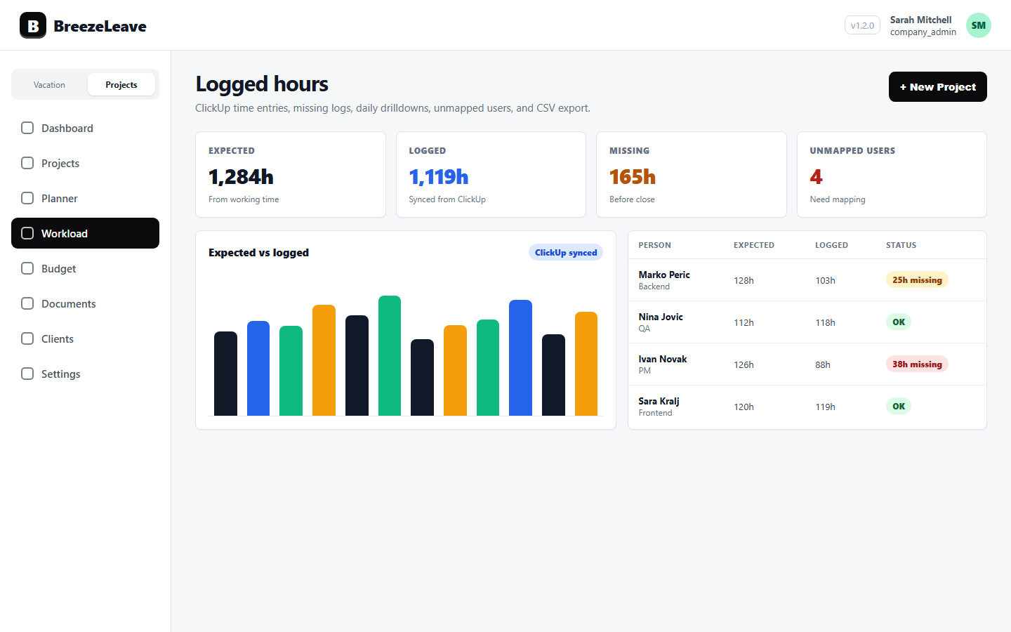
BreezeLeave reads ClickUp time entries, groups the hours by team role (Developer, QA, Designer, Unclassified), and flags cards with unusual role-mix patterns. The point is to let delivery managers investigate while the work is still fresh, instead of reconstructing the story during month close or after a client asks why a deliverable took longer than planned. The product does not pull ClickUp estimate fields, because those fields are inconsistently used across teams and the comparison would lie more than it would help.
What card efficiency actually reads
Card efficiency analytics group logged hours by the role of the person who logged them. Each card ends up with a hour split across four buckets: Developer, QA, Designer, and Unclassified. The flag rules read that distribution and surface cards where the shape of the effort does not match the type of work.
A card with plenty of development time and no QA time may be telling the team that a step was skipped, or that QA was logged somewhere else. A card with more QA than development may be telling the team that rework or unclear acceptance criteria consumed the testing slot. The flags are prompts to look at the card, not judgments about the people on it.
The value is card-level context. Project-level reporting can tell you that a client used 82 hours this month. Card-level reporting helps explain whether those hours were concentrated in a risky feature, spread across routine work, consumed by rework, or weakened by messy classification.
For agencies, that difference matters. Budget, staffing, scope, and client communication all depend on knowing what kind of work is actually taking time, not just how many hours were logged.
Treat signals as prompts, not judgments
Card-efficiency analytics should never become automatic judgment. A signal is a reason to look closer, not a verdict. If the team treats every outlier as a mistake, people will either stop trusting the review or start logging time defensively. Both outcomes make the data worse.
A healthier review starts with a better question: "What does this card need us to understand?" Sometimes the answer is process. Sometimes it is scope. Sometimes it is just normal delivery complexity showing up in the numbers.
- QA-heavy cards may indicate quality risk, unclear acceptance criteria, late defects, or a genuinely sensitive change that deserved extra testing.
- Large cards with no QA may deserve a process check, but they may also be research, documentation, internal setup, or time that was logged against the wrong card.
- Design-heavy cards may point to unclear scope, client indecision, missing inputs, or a discovery task that should have been planned differently.
- Unclassified effort may weaken reporting, budget reviews, and staffing decisions because the team cannot tell what kind of work consumed the time.
The point is not to ask "who caused this?" The point is to ask "what should we learn before this pattern becomes normal?"
The four flag rules
BreezeLeave evaluates every card in the period against four rules. Red flags interrupt the report; yellow flags ask for a quick look. Cards without flags stay out of the panel, which keeps the scan short.
| Flag | Trigger | Useful follow-up |
|---|---|---|
| QA over Dev (red) | QA hours exceed Developer hours by more than 20 percent; both buckets have hours | Review the handoff, test notes, and original scope |
| Large card with no QA (red) | Total above 40 hours, QA bucket empty, card is not design-led | Confirm whether QA was unnecessary or logged elsewhere |
| Design over Dev (yellow) | Designer hours exceed Developer hours while Developer hours are above zero | Check whether future cards need clearer inputs or separate discovery |
| Unclassified majority (yellow) | Unclassified hours exceed 50 percent of the total on the card | Fix team-role mapping for the people whose hours fell into Unclassified |
Beneath the card list, the report rolls the flags up to a 0-100 client delivery health score. The score weights red flags more heavily than yellow and points at which clients deserve a delivery conversation this week. A score of 95 means almost every card passed; a score of 60 means a meaningful slice of the work is flagged. The score is a triage tool, not a verdict.
These rules are deliberately plain. They are meant for weekly operating review, not a research project. A delivery manager should be able to scan the outliers, open the few cards that matter, and decide whether the team needs a correction, a planning change, or no action at all.
Example 1: The QA-heavy feature
Imagine a client portal change estimated as a straightforward implementation card. The development time looks reasonable, but QA time climbs far above the pattern for similar cards. That does not automatically mean the developer produced poor work or the QA process was inefficient.
It might mean the acceptance criteria were vague. It might mean the feature touched more edge cases than expected. It might mean the card bundled too many states into one task: empty states, permissions, mobile behavior, error handling, and notification copy. The useful response is to inspect the card while the details are still fresh and update the next estimate or handoff accordingly.
If the same project shows several QA-heavy cards in a row, the pattern becomes more important. The issue may not be one card. It may be that the project needs stronger requirements, a clearer definition of done, or more planned QA capacity in the next cycle.
Example 2: The big card with no QA
Now take the opposite case. A card has 14 hours of implementation time and no QA time. That deserves a look, but it still is not a guilty verdict. Maybe the card was a technical spike. Maybe the work was copy cleanup. Maybe QA happened on a separate umbrella task. Maybe the team did skip a step because the deadline was tight.
The follow-up should be specific and boring: confirm the card type, check whether QA was expected, and correct the time classification if the work was logged in the wrong place. If the missing QA is real, the team can decide whether to add a review step before the work moves further downstream.
This is where card efficiency supports delivery quality without turning into surveillance. The review does not need to accuse anyone. It just gives the manager a visible place to ask, "Did this card follow the process we wanted?"
Example 3: Design effort that keeps expanding
Design-heavy cards are easy to misread. Sometimes design takes longer because the task was genuinely exploratory. That is normal. The problem is when the project plan treats exploration like production work. If a card needs multiple rounds of concepting, client clarification, responsive adjustments, and content decisions, it may not be a single design card anymore.
A card-efficiency review can reveal that mismatch before it repeats. The team might split future work into discovery and execution. The account owner might ask for missing brand inputs earlier. The project manager might reserve more design time before development starts. None of that requires blaming the designer. It requires seeing the real shape of the work.
A practical rule
If a card-efficiency signal would change next week's plan, review it this week. If it is only interesting trivia, leave it alone. The workflow should create better decisions, not more meetings.
The weekly review workflow
Card patterns are most useful when reviewed with workload, budget, and project context. A simple weekly workflow is enough for most agency teams:
- Start with active projects. Review the cards that moved meaningfully this week, especially cards tied to near-term milestones, retainers, or budget-sensitive work.
- Scan for outliers. Look for QA-heavy work, large cards with no QA, design-heavy effort, and unclassified time.
- Check the card before discussing the person. Read the notes, status changes, comments, and time classification so the conversation starts from context.
- Decide the action. The action might be a time cleanup, a QA check, a scope note, a staffing adjustment, or no action.
- Carry the lesson forward. If the same pattern keeps appearing, update the next estimate, handoff, or client expectation.
The rhythm matters more than the length of the meeting. A 20-minute weekly review can prevent a two-hour month-end debate because the people involved still remember what happened on the card.
This workflow pairs naturally with logged-hours hygiene. Clean time data makes card-efficiency review more trustworthy, and card-efficiency review shows where time hygiene problems are starting to affect delivery decisions.
Connect card patterns to budget and capacity
A card signal becomes more useful when it is connected to the broader project picture. A QA-heavy card on a healthy project may simply need a note. A QA-heavy card on a project that is already close to its budget may require a scope conversation. A design-heavy card during a capacity crunch may mean next week's work needs to move.
The best review combines three views:
- Card detail to understand where effort went and whether the workflow made sense.
- Capacity context to see whether the right people have room to absorb the follow-up work.
- Budget context to decide whether the pattern affects margin, retainer health, or client expectations.
For the planning side, connect this review with project capacity planning. For the finance side, use it alongside project budget tracking. Card efficiency is not a separate reporting island. It is one layer of evidence inside the weekly operating conversation.
Keep the data good enough to trust
Card-efficiency analytics depend on the quality of the underlying ClickUp time entries. If people log time against generic cards, leave work unclassified, or forget to map new users, the signals will be weaker. That does not make the workflow useless, but it does mean the team should treat hygiene as part of delivery operations.
The standard is not perfect data. Perfect data is usually too expensive and too fragile. The standard is clean enough data to support better decisions. When an outlier appears, the first check is whether the time was logged and classified correctly. Only then should the team interpret the delivery pattern.
Start with ClickUp time tracking as the source workflow, then connect it to the card and project reviews that managers already run.
Use the flags as a weekly prompt
Card-efficiency analytics help agencies notice delivery drift before it becomes a client problem, a budget surprise, or a vague retrospective complaint. The four flag rules are plain on purpose: QA over Dev, missing QA on a large card, Design over Dev, and unclassified majority. The discipline is in how the team responds.
Use the signals as prompts. Review them weekly. Check the card before judging the pattern. Tie the follow-up to capacity, budget, and client expectations. That is how card-level data becomes operational instead of noisy.
For the broader agency operating model, connect card-efficiency review with agency project management, ClickUp time tracking, and project capacity planning for agencies.
Related articles
ClickUp Time Tracking for Agency Projects: From Logged Hours to Cleaner Delivery
Logged Hours Hygiene for Agency Teams: Fix Missing Time Before Month Close